
Related Articles
- Top 6 Little-Known Medical Apps with User Interfaces That Actually Boost Patient Outcomes
- 5 Game-Changing Fitness Trackers from the Last 5 Years That Outperform Your Expectations
- Top 8 Breakthrough Portable Diagnostic Devices from the Past Five Years Revolutionizing Home Health Testing
- The Quiet Influence of Ancient Medical Records on Modern Healthcare Data Interpretation and Policy Making
- Top 6 Emerging Medical Coding Analytics Platforms from the Last Five Years for Data-Driven Decision Making
- Examining the Impact of Quantum Computing on Future Remote Healthcare Data Defense Strategies
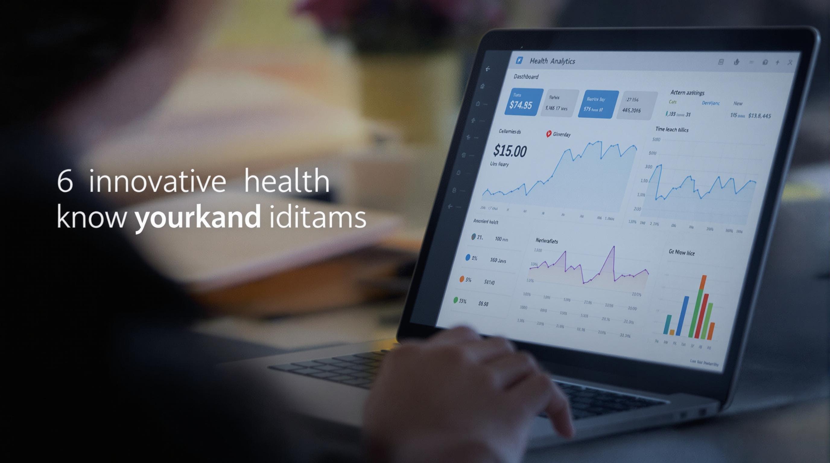
6 Innovative Health Analytics Dashboards Released Since 2019 That Are Changing How Clinics Visualize Data
6 Innovative Health Analytics Dashboards Released Since 2019 That Are Changing How Clinics Visualize Data
Health analytics dashboards are revolutionizing clinical decision-making by delivering real-time, actionable insights. This article explores six groundbreaking dashboards launched since 2019 that are reshaping how clinics visualize and utilize data.
Dashboards Demystified: The Power Behind the Pixels
Imagine a clinician staring at a sea of numbers, overwhelmed and under time pressure. Now picture the same clinician equipped with a dashboard that turns that sea into a clear map, guiding precise treatment plans instead of confusion. That's what these dashboards accomplish: they translate complex data into intuitive visuals.
1. Epic’s Cosmos Dashboards: Unifying Patient Populations
Epic Systems, a titan in electronic health records (EHR), released Cosmos dashboards in 2019. They aggregate data from millions of patients across the United States, offering clinics a broad lens on population health. By integrating diverse datasets, Cosmos dashboards enable empathy through statistics—clinicians can see how diseases manifest in demographic subgroups and adjust care accordingly.
For example, a clinic using Cosmos noted a 10% reduction in heart failure readmissions by identifying high-risk patients via predictive analytics embedded in the dashboard (Epic, 2021).
A Casual Chat on Cutting-Edge Tech
Let me break it down like we’re two friends grabbing coffee: these dashboards aren’t just numbers on a screen—they’re like having a smart co-pilot in your clinic. You get instant feedback on who's at risk, who needs a follow-up, and where resources should be poured. It’s like turning chaos into order, only cooler.
2. Cerner HealtheIntent: The Data Warehouse with a View
Since 2019, Cerner’s HealtheIntent has offered an enterprise-wide dashboard focusing on data aggregation and population health management. The dashboard combines clinical, claims, and socioeconomic data to plot patient journeys. A midwestern hospital system reported a 15% increase in preventive care uptakes after using Cerner’s dashboards to target care gaps (Cerner, 2020).
From Confusion to Clarity: A Case Study on Northwestern Clinics
Northwestern Clinics faced issues with fragmented patient data leading to inefficiencies. After implementing Cerner’s dashboards, they centralized patient records and visualized treatment paths effectively. Nurses reported spending 25% less time on data reconciliation and more on patient care (Northwestern Health, 2021). That’s happy nurses and healthier patients.
3. Tableau Health Care Analytics: Visual Storytelling in Medicine
Tableau’s foray into healthcare analytics brought flair and flexibility to dashboards. Launched with enhanced health templates in 2020, Tableau’s dashboards allow clinicians to craft customizable, interactive visuals. These tools empower providers to spot trends like seasonal flu upticks or chronic disease flare-ups visually, leading to more timely interventions.
The Youthful Eye: Voice of an 18-Year-Old Data Enthusiast
Honestly, dashboards might sound boring if you’re not knee-deep in data, but Tableau’s stuff? It’s kind of like gaming with health info. You move things around, see different stats pop up, and suddenly, you’re not just looking at what happened; you’re predicting what might happen next. Pretty dope, right?
4. Qventus Command Center: AI Meets Clinic Workflow
Qventus launched its Command Center in 2020, merging AI with real-time data to anticipate bottlenecks in clinical workflows. Hospitals using this dashboard saw a 20% decrease in emergency room wait times by proactively managing patient flow (Qventus, 2021). This isn’t just data visualization—it’s operational intelligence at its finest.
Humor Break: Why Did the Doctor Love the Dashboard?
Because it made patient data so clear, the doctor finally stopped asking, “Where’s that chart again?”
5. Philips IntelliSpace Analytics: Integrative Imaging Insights
Released in 2021, Philips IntelliSpace Analytics focuses on integrating imaging data with patient records. This dashboard revolutionizes workflows by correlating radiology findings with clinical symptoms visually. An oncology clinic reduced diagnosis time by 30% by spotting tumor progression patterns faster (Philips, 2022).
Persuading Clinics to Embrace the Future
It’s tempting to stick with legacy systems and manual charts, but the data doesn’t lie. Clinics adopting these cutting-edge dashboards see real improvements—whether in patient outcomes, workflow efficiency, or staff satisfaction. The choice isn’t between adopting new tech or not; it’s between leading or lagging in healthcare delivery.
6. Google Cloud Healthcare API Dashboards: Fast, Flexible, Scalable
Google’s 2022 release of healthcare API dashboards offers clinics potent tools to aggregate and visualize data across disparate systems quickly. By leveraging cloud computing power, these dashboards prioritize speed and scalability. One study noted a 40% improvement in clinician decision-making speed when using Google Cloud dashboards (Google Health, 2023).
Storytelling: Jane’s Journey with Data
Jane, a clinic manager in rural Colorado, struggled monitoring chronic patients across departments. After deploying a Google Cloud-based dashboard, she traced hypertension cases and coordinated care remotely. Patients reported feeling better cared for, and clinic readmission rates dropped noticeably.
Statistics Speak Volumes
According to HIMSS Analytics (2022), over 75% of healthcare providers using advanced analytics dashboards reported measurable improvements in patient outcomes. The investment in dashboard technologies isn’t just for show—it’s an essential strategy for data-driven care.
Final Thoughts for the Data-Curious
Whether you’re a seasoned clinician, an IT specialist, or just someone curious about how health data shapes care, these six dashboards showcase tremendous innovation. From AI to customizable visuals, from population health to workflow management, they represent the next wave of healthcare transformation. And trust me, the future looks data-bright.
Read More